UX/UI Specification
This section describes the totality of MyPaint’s UX/UI, including the relationship between specifications and the backend. It is the primary source of reference for developers and designers when suggesting, discussing, and prototyping new user-facing features for MyPaint.
Warning
This section is heavily in development
UX/UI Philosophy
As MyPaint continues to grow and expand its feature set, the project needs to ensure that using MyPaint is intuitive and simple. The MyPaint program should:
- Let you scribble without thinking.
- Not feel bloated and confusing.
MyPaint Should be Intuitive
MyPaint needs to read the end-user’s intentions at each scale of UX design. All users at any level of technical or artistic skill should be able to work in flow without thinking about the program.
- Ideally users won’t need to consult the manual after learning the fundamental MyPaint workflow.
- Drawing with MyPaint should be fast for experienced users.
- UX at the macro level should have a coherent topography that the user can easily memorise and navigate.
- UX at the micro level needs to work in a way that makes sense and is useful to the end user.
- Frequent interactions should be fast: Measure speed in milliseconds, consider all sensible inputs, and maximise legibility of information.
Using MyPaint Should be Easy
MyPaint should make the act of drawing as simple as possible. This doesn’t mean that MyPaint shouldn’t be technically complex, just that any technical complexity should be presented to the user in a way that’s simple for them.
- A new user should immediately know how find to every feature in MyPaint.
- Deduction test: Get a new user, describe a feature to them, and ask them where they might find it.
- Induction test: The user wants to do something that is a capability of MyPaint, but has never used the capability before. Can they find our implementation of the capability?
- Even at its most complex, MyPaint’s UI should not feel crowded or overwhelming.
MyPaint Should be Accessible
MyPaint needs to scale to the needs and circumstances of different users, their setups, and their workflows.
- The capabilities of MyPaint should scale with the needs of the user.
- Every part of the UI with few exceptions should be able to be moved or hidden.
Getting Started
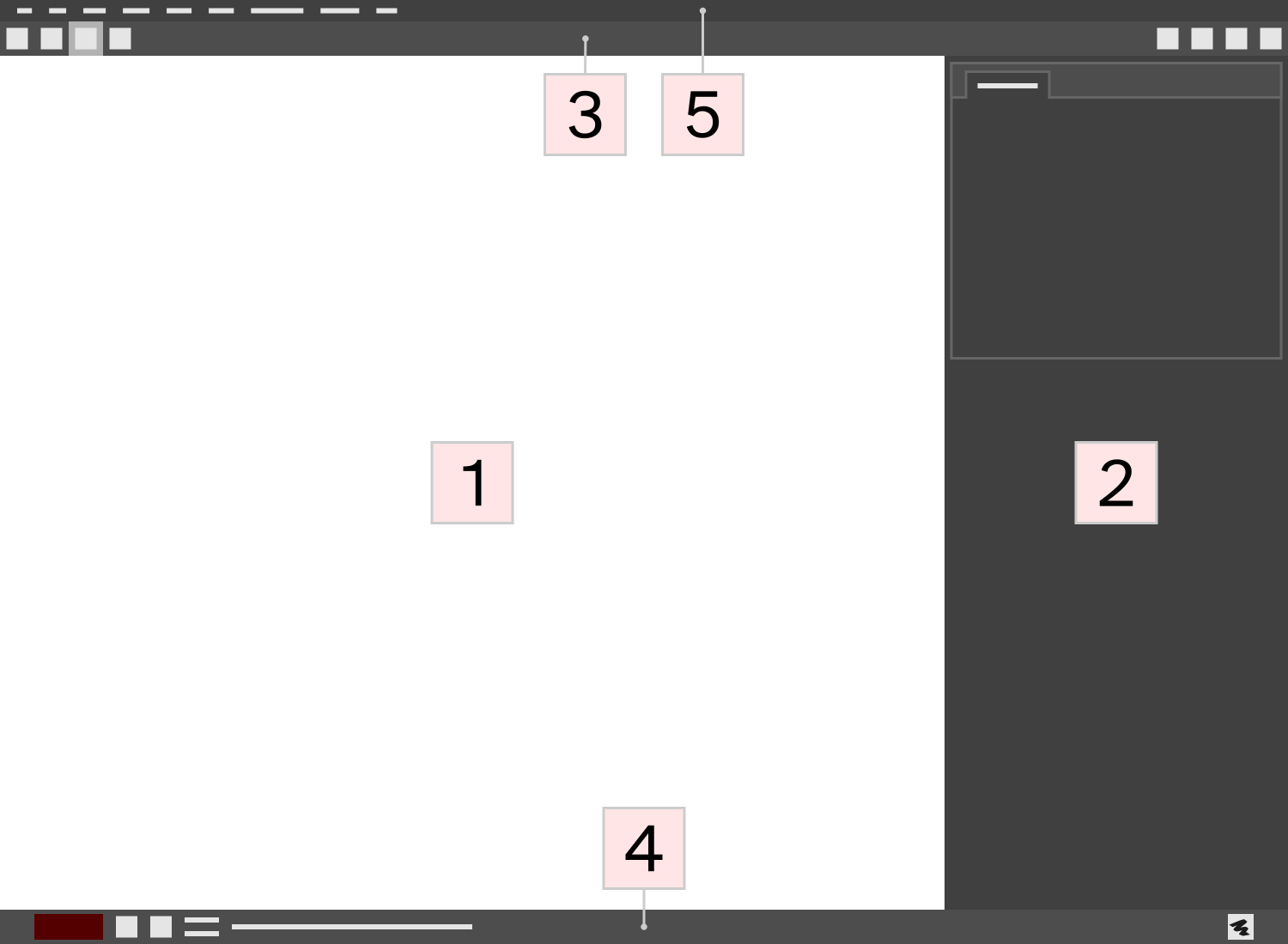
MyPaint’s main window is the entry point from which all user interaction takes place.

Concepts
Concepts do XYZ
Pages in this Section
Toolbar-Top
Toolbar-Bottom
Preferences
Panels
Menubar
Description of MyPaint’s menubar
Concepts
Files
Scraps
Layers
Layer mode
Masking
Brushes
Brush mode
Glossary
<strong>Rubberband selection</strong>
<strong>Working file</strong>
Canvas
Accessibility
This should be something to look further into. Let’s get involved with the community and see what they might need.
One of the big assumptions I feel that MyPaint makes is that visual art can only be made by people who are not visually impaired, and so it doesn’t try to make it easier for people with such impairments to paint.
An assumption of dexterity is something else I would like to challenge. Surely there are types of visual art that aren’t underpinned by extremely dextrous hands.